Custom Kitchen Renovation, Oakville
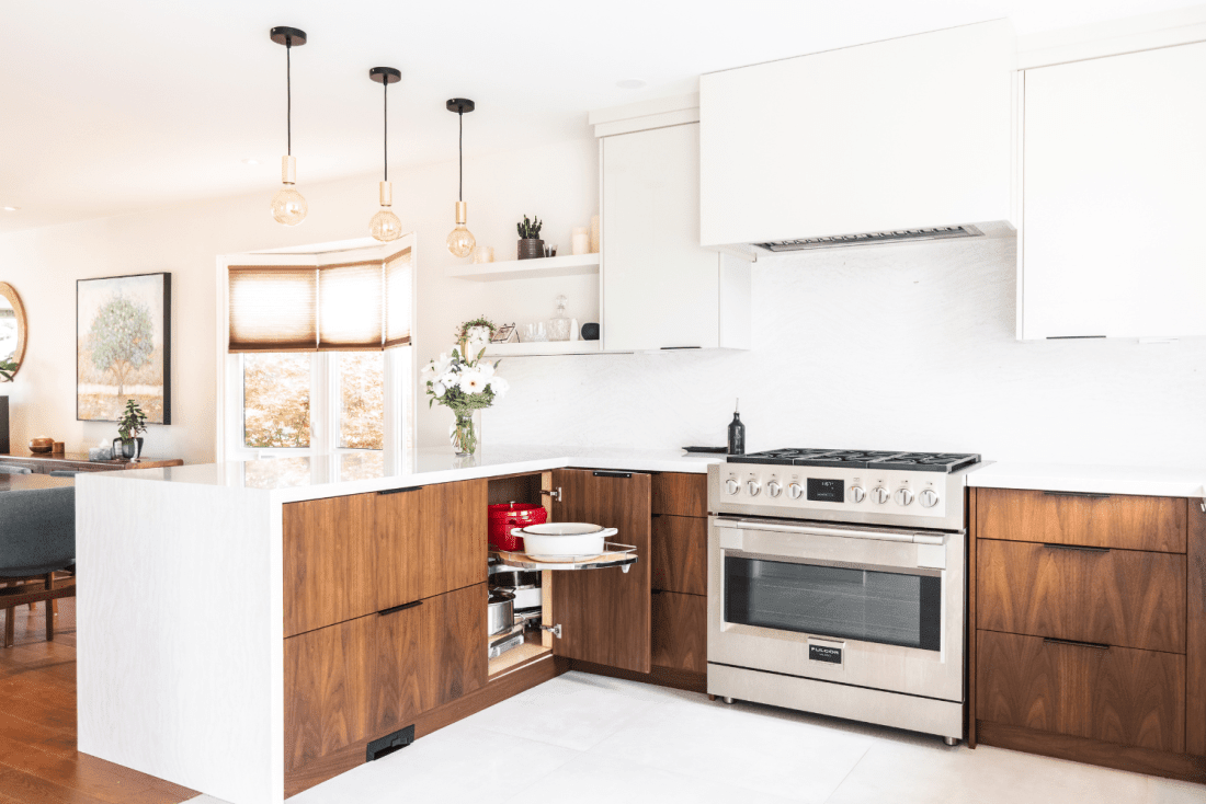
Dive into this warm and spacious contemporary kitchen featuring flat-cut walnut wood, high gloss Schenk, Cambria quartz countertop, and full-height backsplash.
This young-family household with four children is bustling with everyday activities, including homeschooling. They wanted a kitchen and dining space that was open and accommodating to their daily routine.
They decided to renovate their kitchen and create the space of their dreams. Their goal was to create a space that perfectly fits their everyday routine and organizational needs. Before the renovation, there was a wall dividing the front room dining space from the kitchen. This layout was limiting and blocked the flow. The removal of the wall opened the two spaces – creating a natural flow between them.
With this new kitchen layout, the family can sit at the dining table in the front room or at the peninsula island in the kitchen. The space is now open, airy, and full of light. Since they homeschool their children, this open layout allows the area to function accordingly during school breaks, learning, and socializing.
| PROJECT DETAILS | |
| City: | Oakville |
| Kitchen Size: | 230 sq. ft. |
| Layout: | U Shape with Peninsula |
| Services Provided: | Custom Kitchen Cabinetry (Design, build, install) + Countertops |
The Design Approach
Our goal aimed to create an open-concept, family-friendly kitchen that could be used for the whole day. Our clients wanted to maximize every square inch of the kitchen to have functional organization and storage solutions.

The Concept
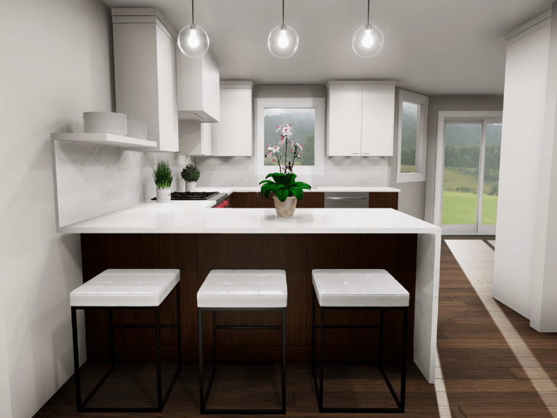
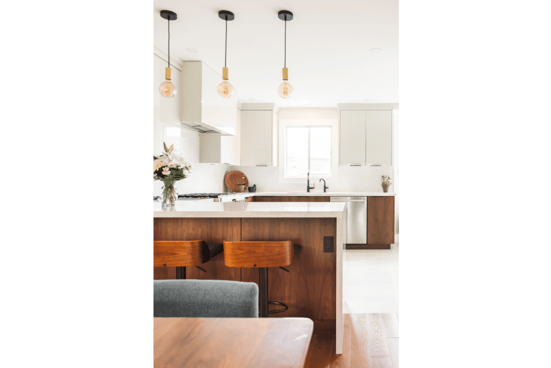
The inspiration for this design was a monochromatic finish scheme with timeless elements. The U-shape layout opens the kitchen and dining space and provides a peninsula that functions as a working, eating, or lounging space for the family.
Design Tip:
If you are thinking about renovating your kitchen (or home in general), make a list of what doesn’t work in your current space and what you want your new space to provide. We all function differently, some may love to have an island/peninsula, while others see no use for it. We aren’t looking to focus on the ‘negatives’, but instead to keep them in mind when it’s time to design. If you know you do not like lifting your plates above your head into the upper cabinets, consider larger drawers with peg dividers instead. When you identify the things that aren’t working for you, it simultaneously helps determine what you need. Create a wish list of everything you want and plan out where you want things to be kept that benefit your everyday routine.
The Purpose
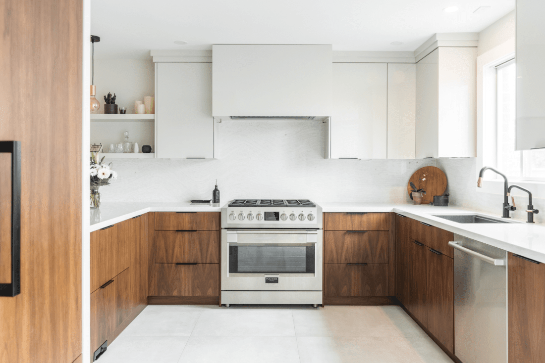
The upper cabinets and range hood are constructed of a high gloss laminate that almost disappears into the quartz backsplash. These upper cabinets offer functional storage and create a modern sleek look. The extended open shelving works to create harmony between the kitchen and front den space, with lots of light and open space. This open shelving creates an opportunity for seasonal décor or accent colours to create a pop in the space.


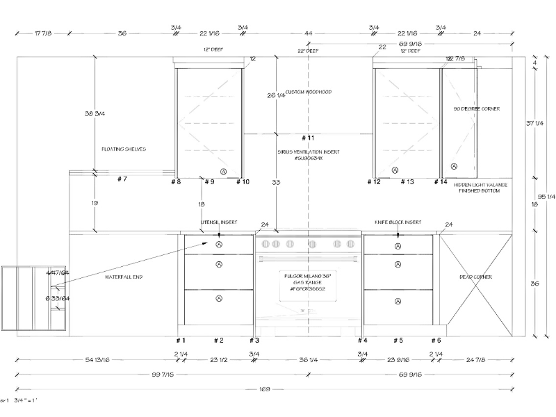
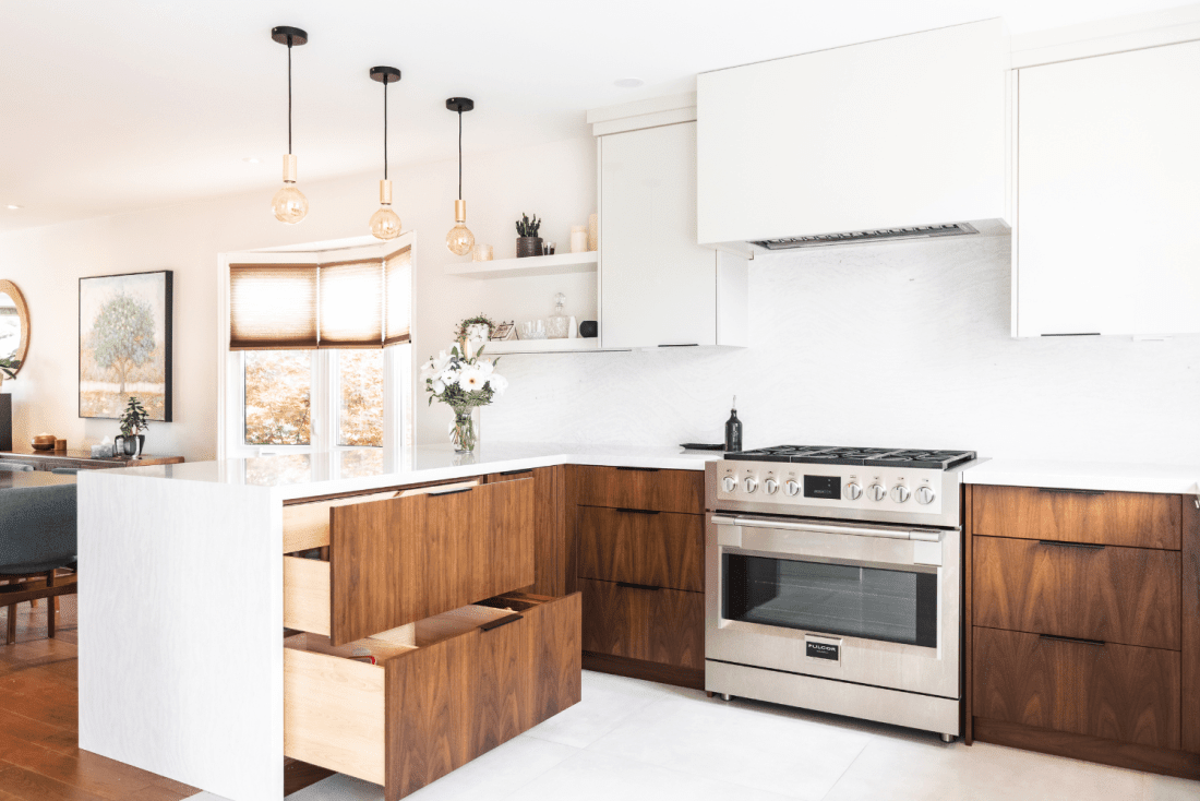
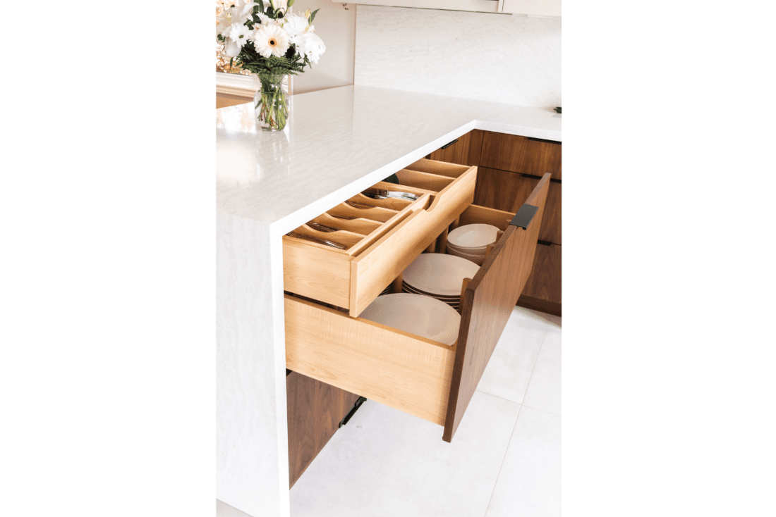
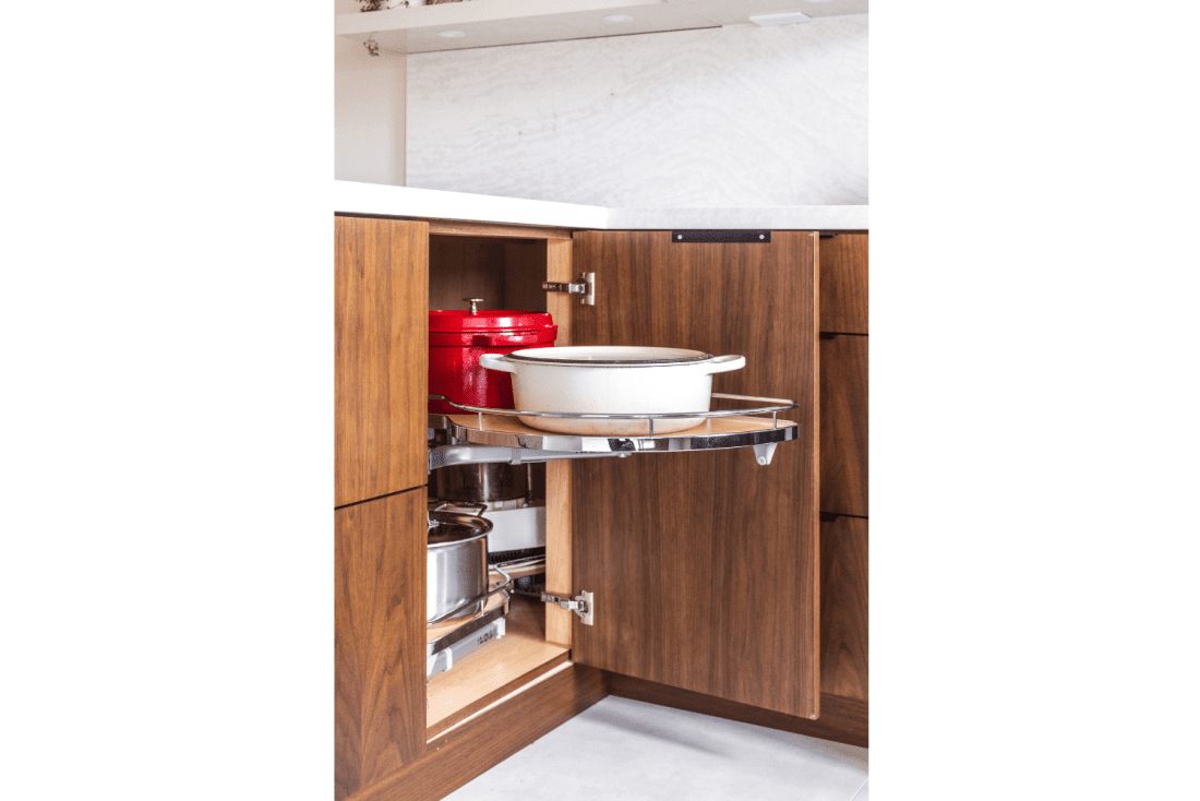
Below the peninsula, there is a cabinet with two large drawer fronts, that hide the third drawer inside. Here you will find peg dividers for everyday dishware, and the hidden interior roll-out drawer above houses a sliding two-tier cutlery tray and utensil divider. Next to this cabinet is a stylish Lemans 45 pull-out unit that allows complete access to the corner cabinet space and stores large cookware.
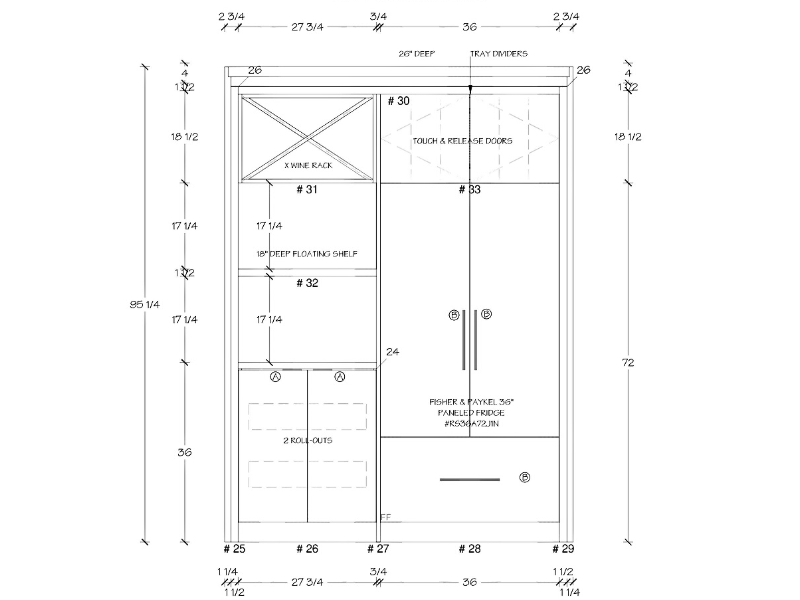
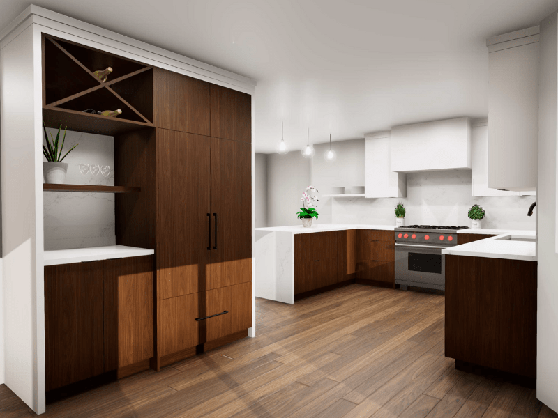
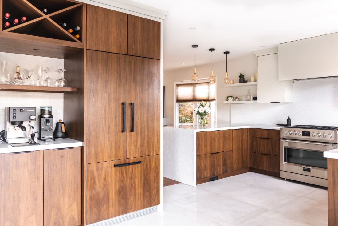
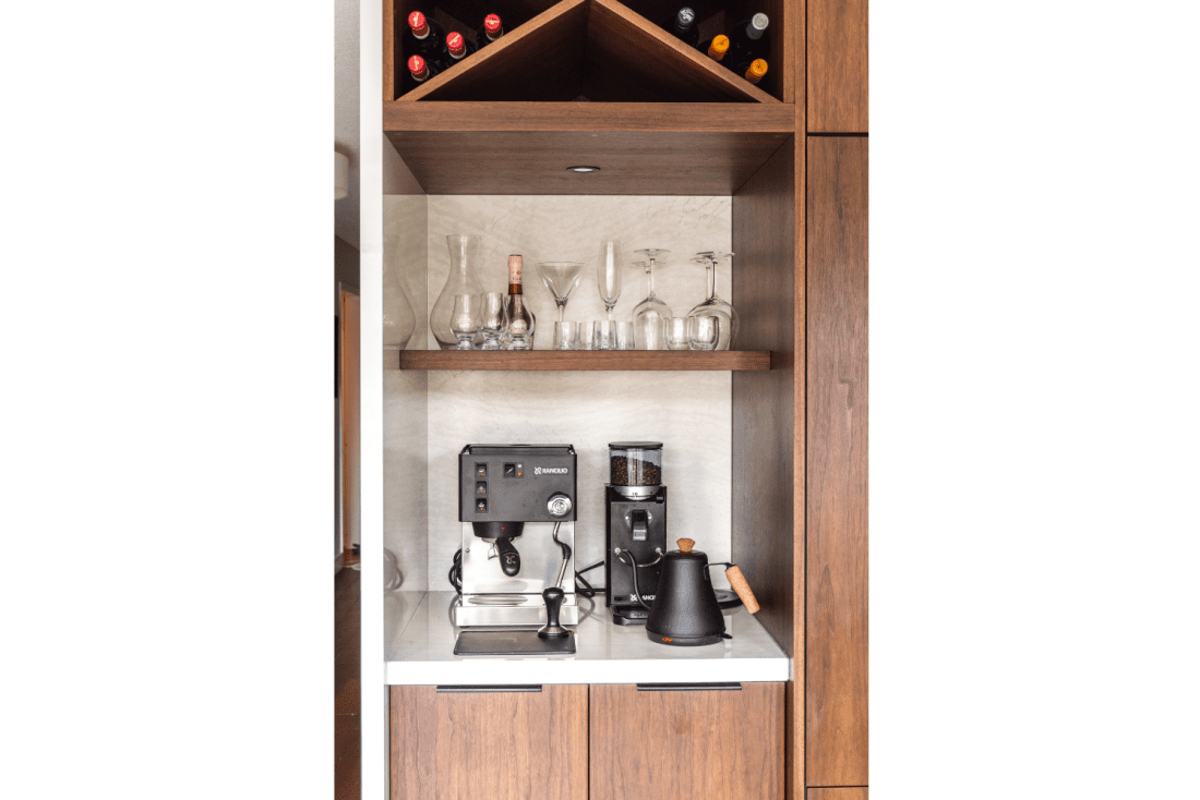
The panelled fridge and freezer ‘island’ houses an integrated coffee and wine station. Our clients love coffee and wine. They wanted to have a designated space to enjoy a beverage even while someone else is busy in the kitchen. This coffee corner features an ‘X’ bottle rack, a walnut framed shelf with clear glass insert, a quartz backsplash, countertop space for accessories, and doors below with two rollouts for extra storage. This zone creates a lounge area for the two parents. Paired with club chairs, this corner is perfect for them to enjoy their coffee or wine together and catch up.

Since they were keeping the kitchen in the same location (and same U shape layout), some critical thinking was required to ensure their new kitchen would be purposeful. Instead of cramming everything into their existing U-shape layout and having to compromise wants, we accommodated their design needs by trialling layouts and decided this one offered the most function and flow.
Design Insight:
A peninsula can help you achieve the same function as an island in a smaller space.
A peninsula extends from the wall or adjacent countertop with three accessible sides – it can work as a divider between two spaces without completely separating them. Based on the size of your kitchen and your functional needs, a peninsula can add an efficient counter workspace, seating for meals and entertaining, or be a homework area with a charging center for phones and laptops.
The Details
The main cabinets are finished in flat-cut walnut wood. The slab door and drawer fronts showcase the beautiful cathedral patterning in walnut wood. The walnut, the star of the show, creates emphasis in the space, with the other monochromatic finishes complimenting it. A mix of hardware was used; simple tab pulls for drawers and upper cabinets, detailed accent pulls for appliances, and touch and release for a sleek look where hardware is not needed.
Our client chose Cambria Quartz for their countertops and backsplash. They wanted a design that they would not feel tired of. They selected a beautiful cream-white design with subtle-warm veining that is elegant and classic. A waterfall end on the peninsula creates a clean look while providing durability in a high-traffic area.
The finishes in this kitchen create an impressive impact - reflective high-gloss laminate, smooth polished countertop and backsplash, and soft-matte stained walnut.

Consider a monochromatic scheme for your cabinetry. By having a monochromatic scheme, you can use different décor pieces with varying colours to jazz up your space. We have all seen the various colours of mixers or baking dishes. Whether it is the expected seasonal décor or a few unique pieces you brought home from your latest trip – you can have these items on display in harmony.
A monochromatic colour scheme gives you the freedom to mix things up from time to time.
The Final Results
This kitchen space is airy, full of light, and sophisticated. The walnut wood creates warmth against the creamy quartz and black hardware that creates an elevated and refined kitchen.
Contact us to Get Started
Feeling inspired about your kitchen renovation? Give us a call or visit our showroom today!
